The choice of a kitchen color in 2025 is no longer just a matter of personal taste. The increasing integration of the kitchen into the living space, especially in open-plan configurations, requires thinking in terms of chromatic continuity with the living room and the entrance. The shades chosen this year reflect this requirement: they function as material colors, capable of structuring a volume without fragmenting it.
Kitchen Color and Open Space: Thinking in Continuity with the Living Room
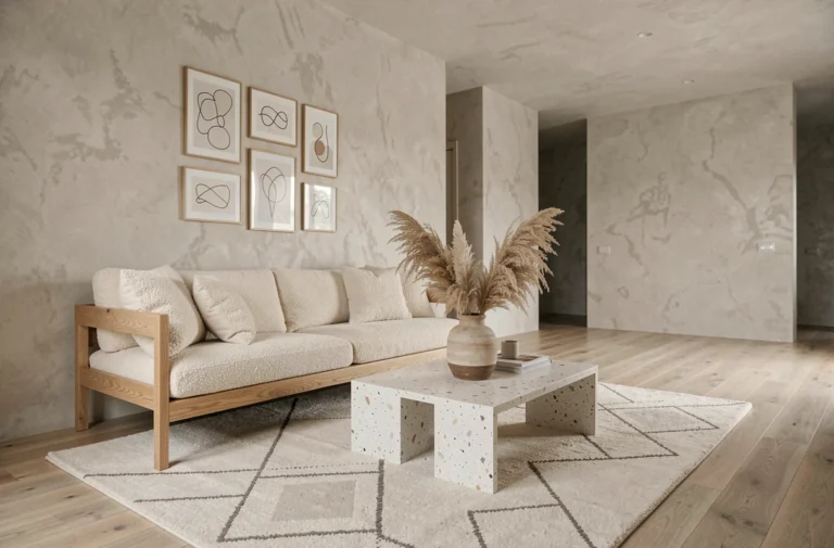
The open kitchen connected to the living room radically changes the logic of color choice. A shade that works in a closed room can create a harsh visual break against a light living area. We observe that the 2025 palettes favor tones that are sufficiently muted to blend into the living space while maintaining a distinct identity on the furniture facades.
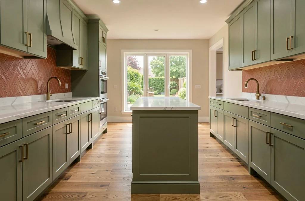
Solid facades and calm tones visually extend the living area. Sage green, greige, or deep blue share a common characteristic: their moderate saturation. They absorb light without reflecting it, which avoids the “colored block” effect in an open space. In contrast, a bright red or lemon yellow, appealing in photos, fragments the perception of space as soon as the kitchen is visible from the sofa.
To delve deeper into the trendy kitchen colors for 2025, we recommend starting from the existing living room color chart and working with shades rather than contrasts.
Greige and Medium Beiges: The Compositional Base Replacing White
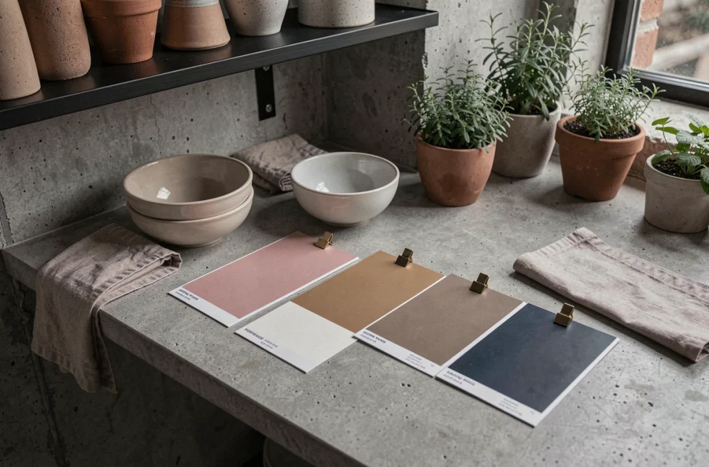
White remains a common reflex, but it is clearly declining in favor of greige (gray-beige) and medium beiges. This shift is not cosmetic: greige serves as a background for associations with blue, green, or walnut brown, where pure white imposed a sometimes too stark contrast with natural materials.
Specifically, a medium greige absorbs reflections from light wood or terrazzo without overwhelming them. It tolerates variations in natural light better than optical white, which quickly yellows under warm lighting. It is a material color: it behaves differently depending on the finish (matte, satin, textured) and the support (wall, lacquered facade, coated backsplash).
Greige allows for two compositional strategies:
- A monochrome kitchen where only textures (wood, stone, brushed metal) create relief, suitable for small spaces that cannot support multiple shades
- A bicolor kitchen where greige occupies the lower cabinets and a sage green or muted blue dresses the upper cabinets or the backsplash
- A reminder of greige on the adjacent living room wall, to blur the boundary between the two spaces in an open configuration
Black in the Kitchen 2025: Matte Accent Rather Than Total Look
Black has dominated high-end kitchens in recent years, often in a total look. This approach is declining. Black is evolving into an accent role, used in matte finishes on specific elements: handles, faucets, partial backsplashes, open niches.
When paired with warm neutrals or muted greens, matte black structures without weighing down. In contrast, an entirely black kitchen poses maintenance challenges (fingerprints on matte facades, visible dust on shiny surfaces) and reduces perceived brightness in poorly lit kitchens.
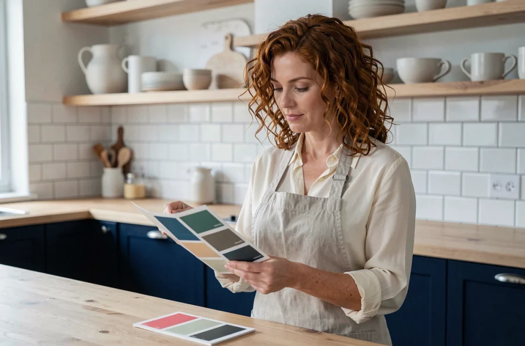
We recommend limiting black to a maximum of one-third of visible surfaces and concentrating it on elements that benefit from graphic contrast: the countertop, a central island, or interior woodwork. The rest of the palette should remain in mineral tones (greige, sandy beige, verdigris) to maintain depth without suffocating the room.
How to Choose a Kitchen Color Based on Light and Materials
Most decor articles present trendy colors without addressing their actual behavior under different lighting. A north-facing sage green leans towards gray. A terracotta exposed to full south can become aggressive in summer. Testing the shade on a sample directly in the kitchen, at three different times of the day, remains the most reliable method before finalizing a choice.
The type of material also influences color perception. The same deep blue will appear darker on a lacquered facade than on a matte finish. Natural materials (wood, polished concrete, marble) alter the reading of the shade with their own hue and grain. This is why the choice of color cannot be separated from the choice of support.
Some concrete guidelines to avoid common mistakes:
- In poorly lit kitchens (north orientation, small window), favor light shades from the selected spectrum: almond green rather than forest green, washed sky blue rather than midnight blue
- On smooth and shiny facades, strong shades amplify reflections and mark dirt more: prefer a matte or satin finish
- With a dark wood countertop (walnut, smoked oak), avoid walls in the same brown tones to prevent creating a monolithic ensemble without relief
Bright Colors in the Kitchen: Where to Place Them Without Disrupting the Decor
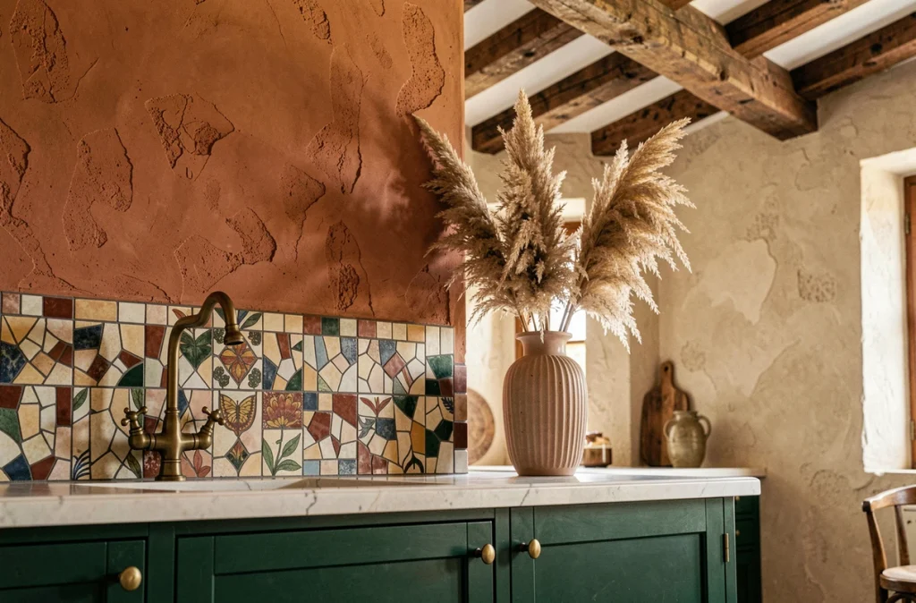
Terracotta, old rose, and cherry red appear in the 2025 palettes, but their use requires moderation. A bright color works better in a limited flat area than as a dominant surface. A terracotta wall behind an open shelf, an old rose niche interior, a red tile backsplash: these touches are enough to add character.
The classic mistake is to paint all facades in a strong color, only to regret it two years later. Bright shades quickly saturate the eye in a space where one spends time daily. Reserving them for easily changeable elements (wall paint, accessories, textiles) allows for following trends without committing to a heavy renovation.
The choice of a kitchen color in 2025 ultimately hinges on three technical parameters: the available light, the degree of openness to the living area, and the nature of the materials already in place. Starting from these constraints rather than an isolated trend remains the best guarantee of a coherent result over time.